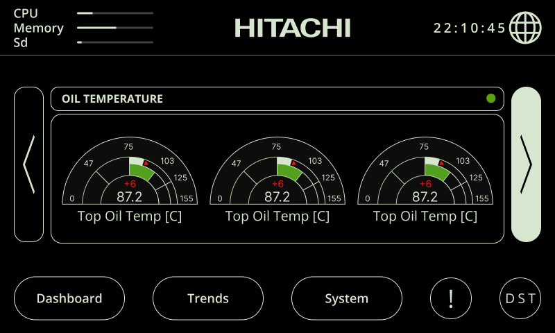
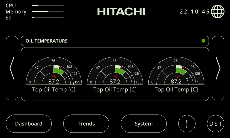
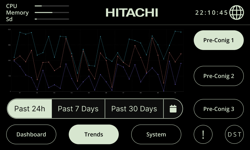
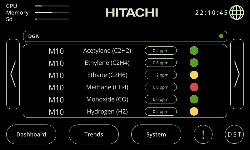
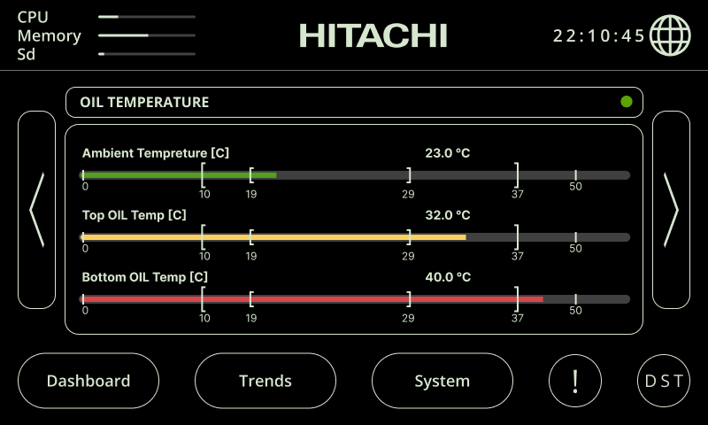
The final phase of the high-fidelity prototype focused on two critical features: dark mode and a responsive minimal interface for the 7-inch display mounted near the transformer to show real-time status.
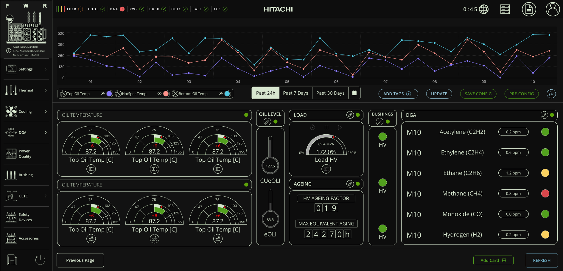
User research revealed that operators often worked in low-light conditions, such as during night maintenance or in confined service areas, where glare and eye strain reduced efficiency and increased error risk. To address this, I incorporated contrast-optimized dark mode validated against peer-reviewed visibility and legibility standards. I adjusted color contrast to maintain clear visual hierarchy and legibility under low luminance without causing visual fatigue.
The result was an interface that improved readability in field tests, reduced visual strain during extended use, and better supported technicians performing time-sensitive tasks under challenging lighting conditions.
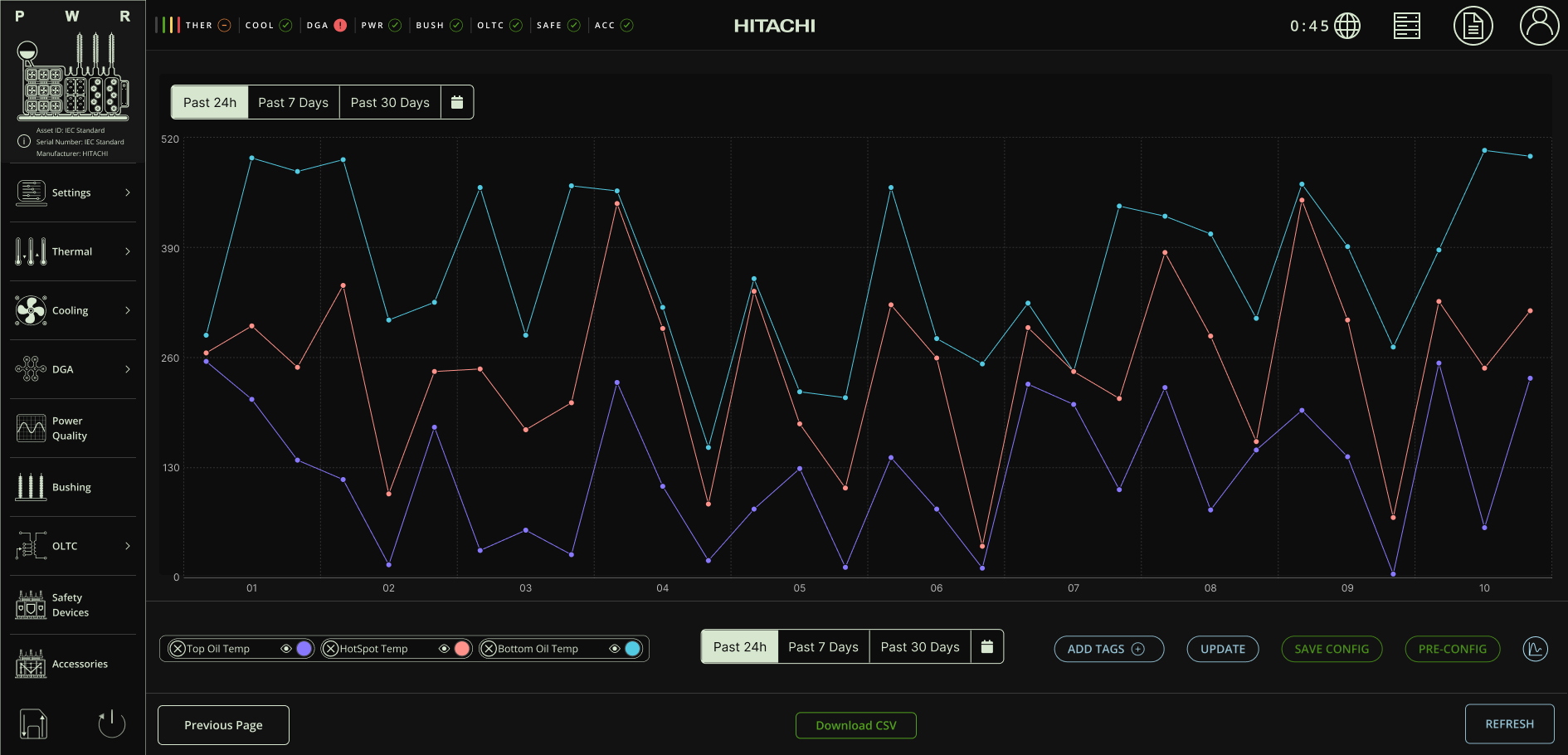
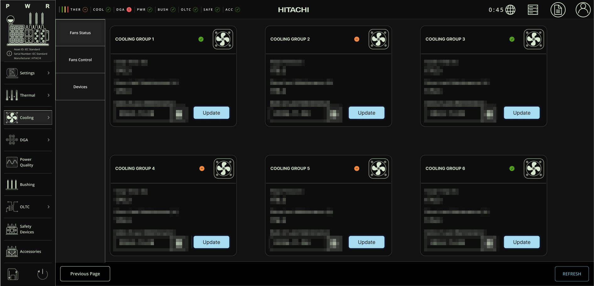
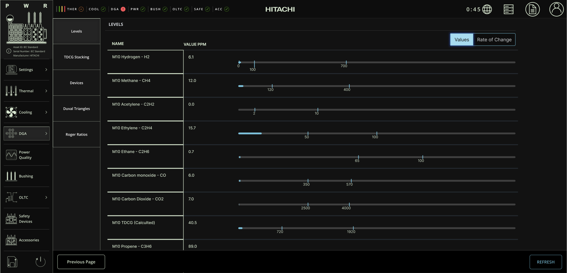
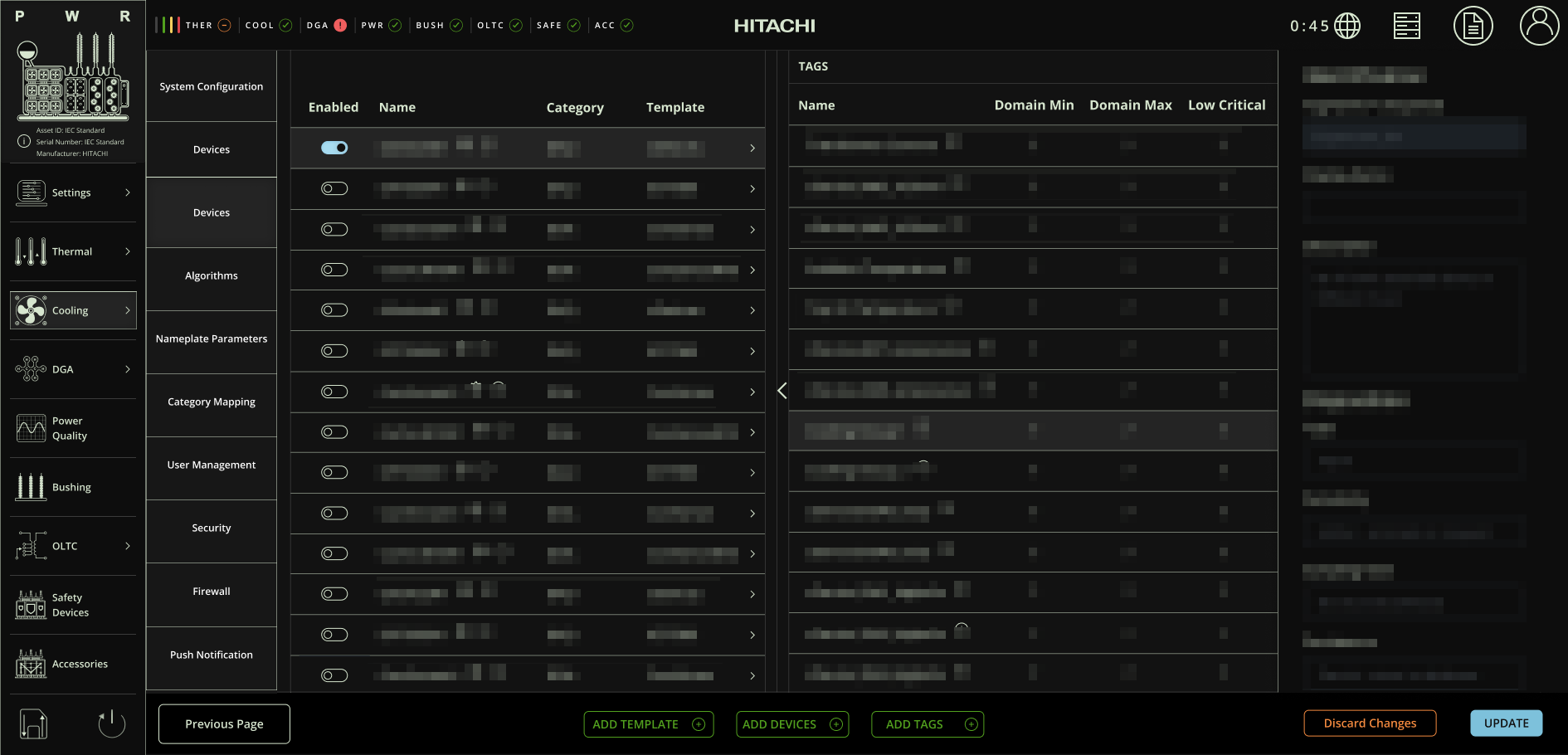
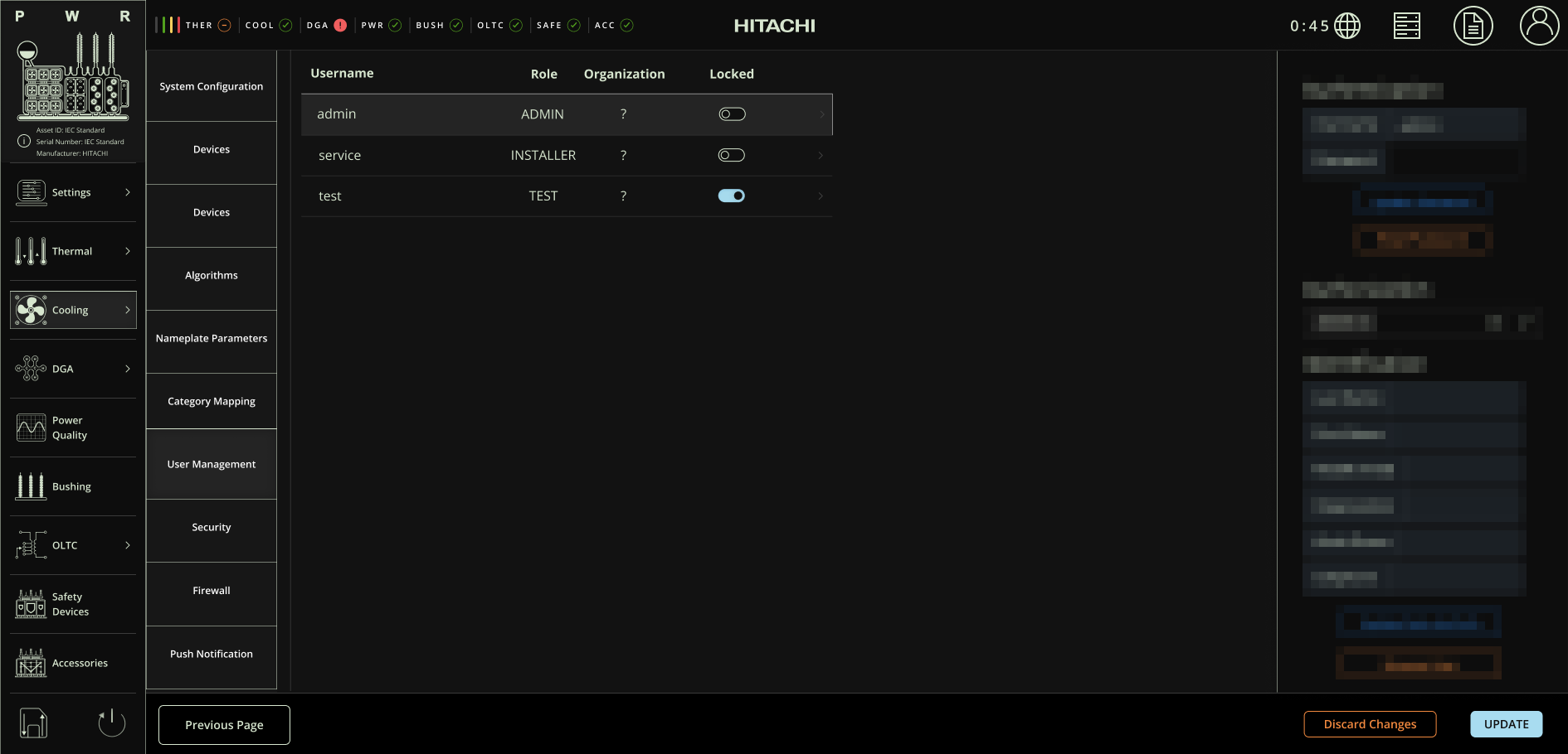
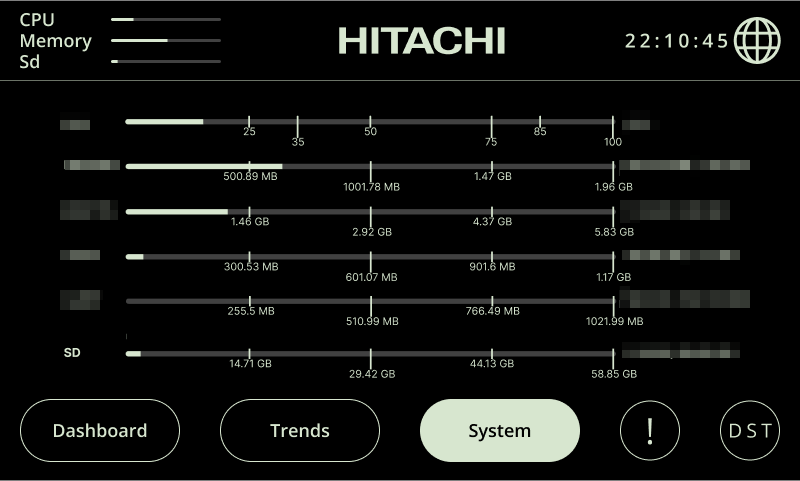
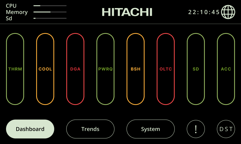
The responsive minimal interface was designed for the 7-inch physical display mounted next to the transformer, prioritizing clarity, real-time monitoring, and ease of interaction for field technicians.
Key design considerations:
Optimized readability with large, high-contrast typography for quick data recognition in outdoor and low-light conditions.
Critical data emphasis is achieved by displaying only essential transformer indicators to minimize cognitive load.
Touch-friendly UI with simplified components, tested specifically with technicians wearing thick gloves to ensure reliable interaction in field conditions.
Dark mode integration with contrast levels adjusted according to research to reduce eye strain while maintaining visibility in dim environments.