IAC: Website Redesign
As the Lead UX Designer, I directed a 9-month team project to overhaul the website for the Iranian Architecture Center. The center, a private institution offering software and design courses for bachelor's and master's students in Design, needed a modern platform that effectively markets courses to new students while providing online classes and services for existing users.
Working within significant budget constraints required a pragmatic and efficient UX process. Our approach focused on high-impact methods to gather actionable insights without a traditional, long-form research phase.
Data-Informed Research: We began by conducting a heuristic evaluation of the existing site to identify critical usability violations. We supplemented this analysis with a review of website analytics, focusing on metrics like user dwell time and particularly on mobile device usage.
Mobile-First Strategy: The website analytics clearly showed that most students used the mobile version of the site to check for new courses and offers. Based on this critical insight, we proposed and led a mobile-first design strategy. After presenting my findings to the board, we set two primary goals: redesigning the homepage's information hierarchy for mobile and increasing user engagement on the course catalog and subscription pages.
Ideation and Prototyping: Focusing on our mobile-first strategy, We designed and developed a low-fidelity prototype. This prototype established the new information architecture and core user flows for the mobile experience, serving as the blueprint for the responsive desktop design.
Agile Collaboration: We established a close, iterative feedback loop with the development team. Through regular design reviews, we refined the prototype, ensuring that all design decisions were both technically feasible and consistently aligned with our strategic goals.
Impact and Results
One year after the redesigned site was launched, a review of the website analytics confirmed the success of our data-driven approach. The new design achieved a 34% increase in user dwell time on the course catalog pages, directly meeting a primary strategic goal and validating our focus on improving user engagement.
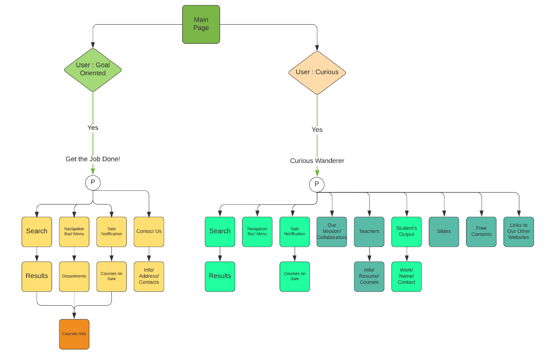
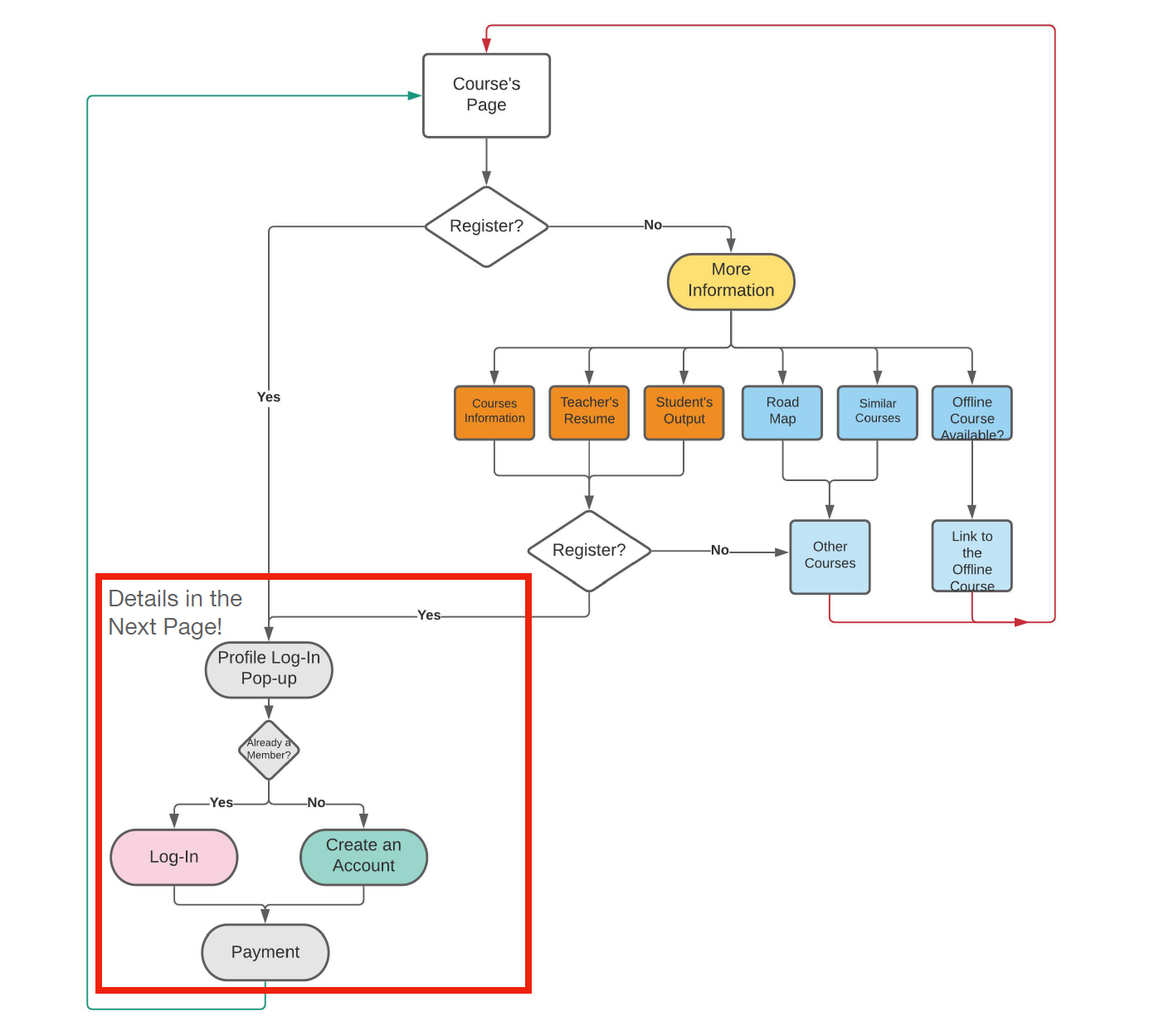
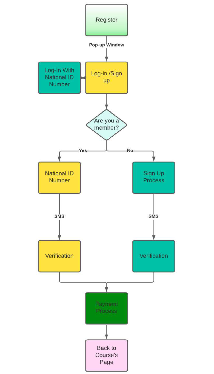
Derived from website analytics and heuristic analysis, these user flow diagrams illustrate key student journeys through the website. We used these diagrams to pinpoint critical drop-off points, understand where students disengaged, and identify opportunities to optimize the flow from course discovery to registration on both mobile and desktop interfaces.
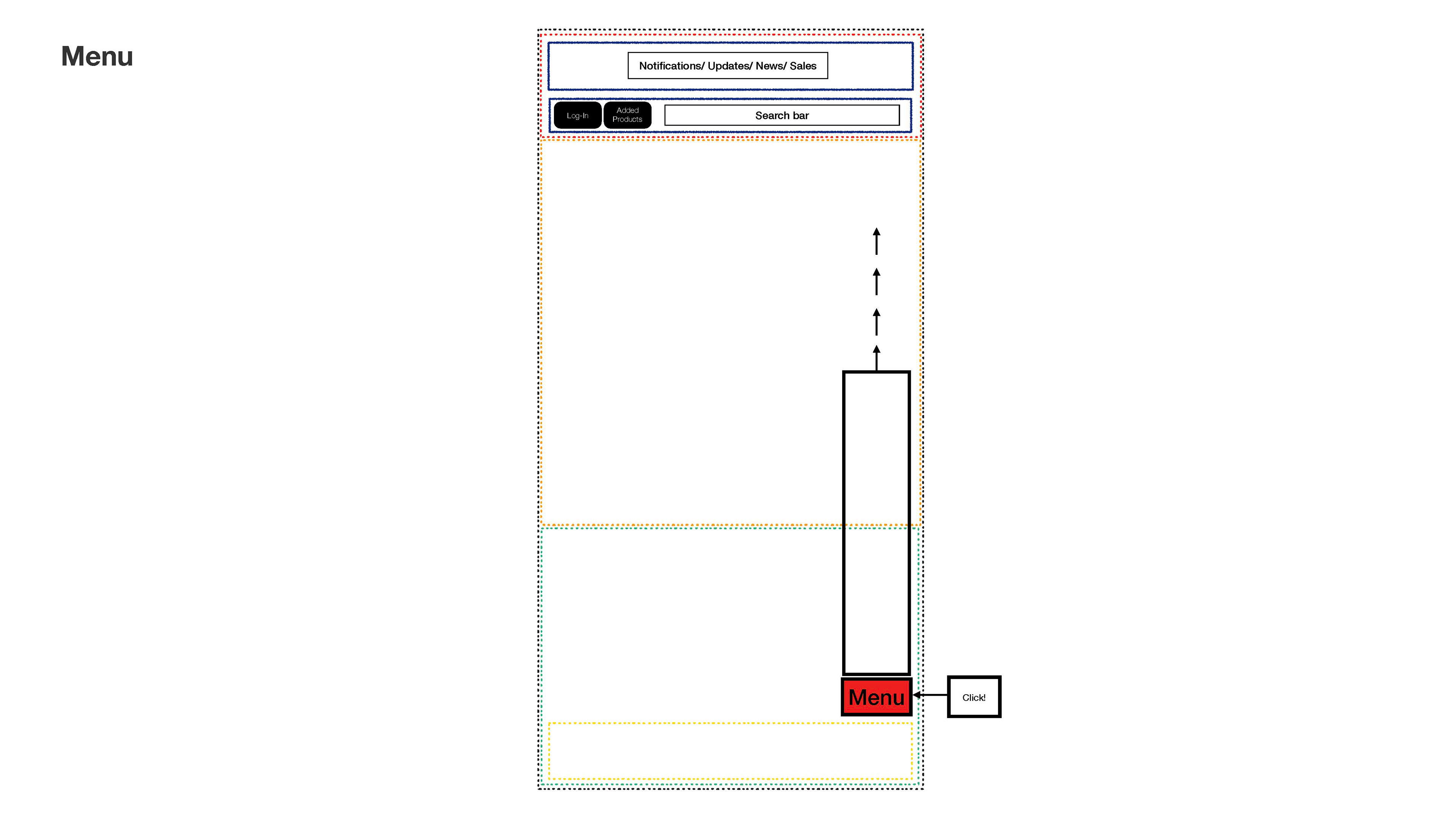
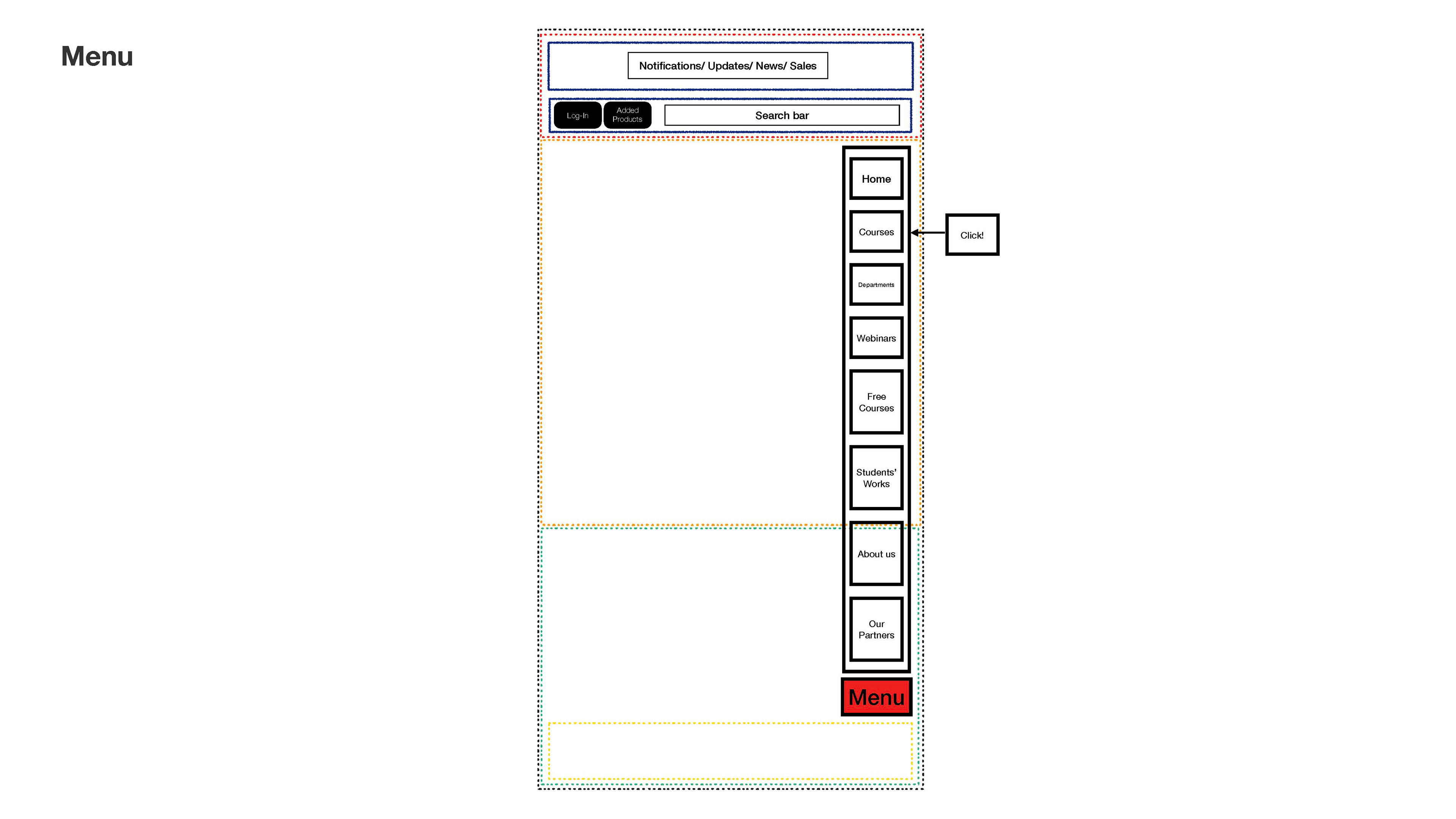
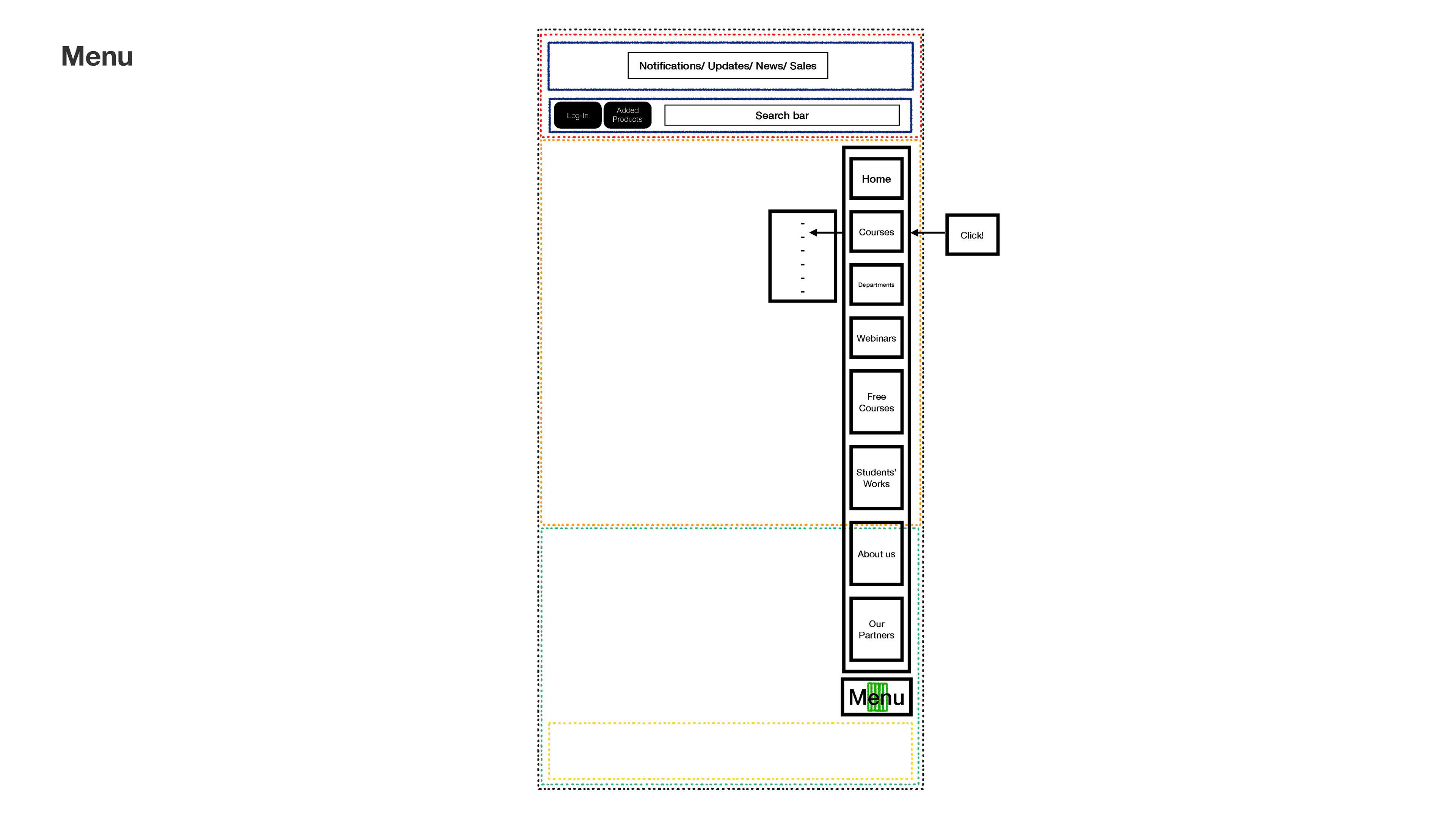


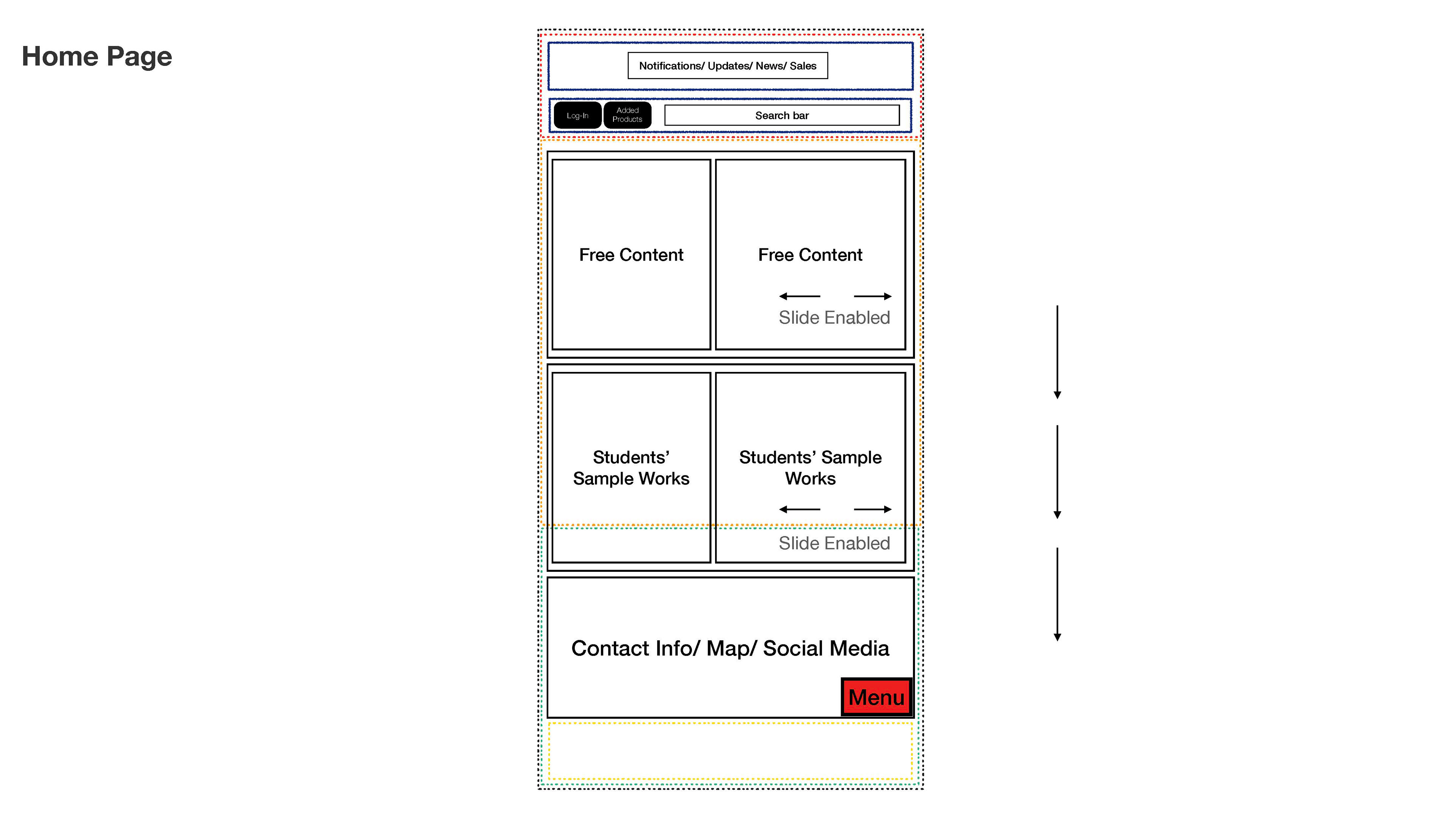
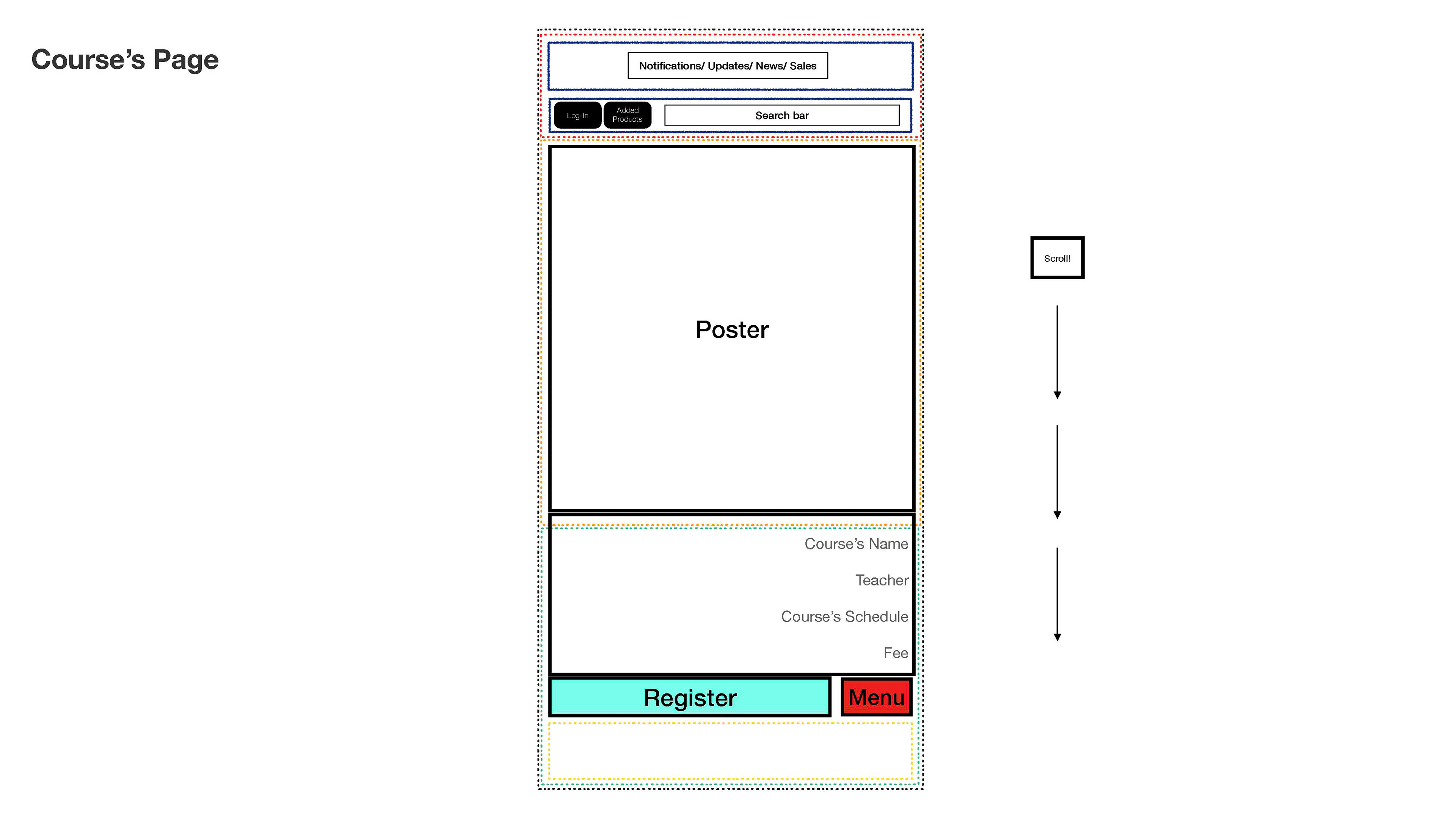
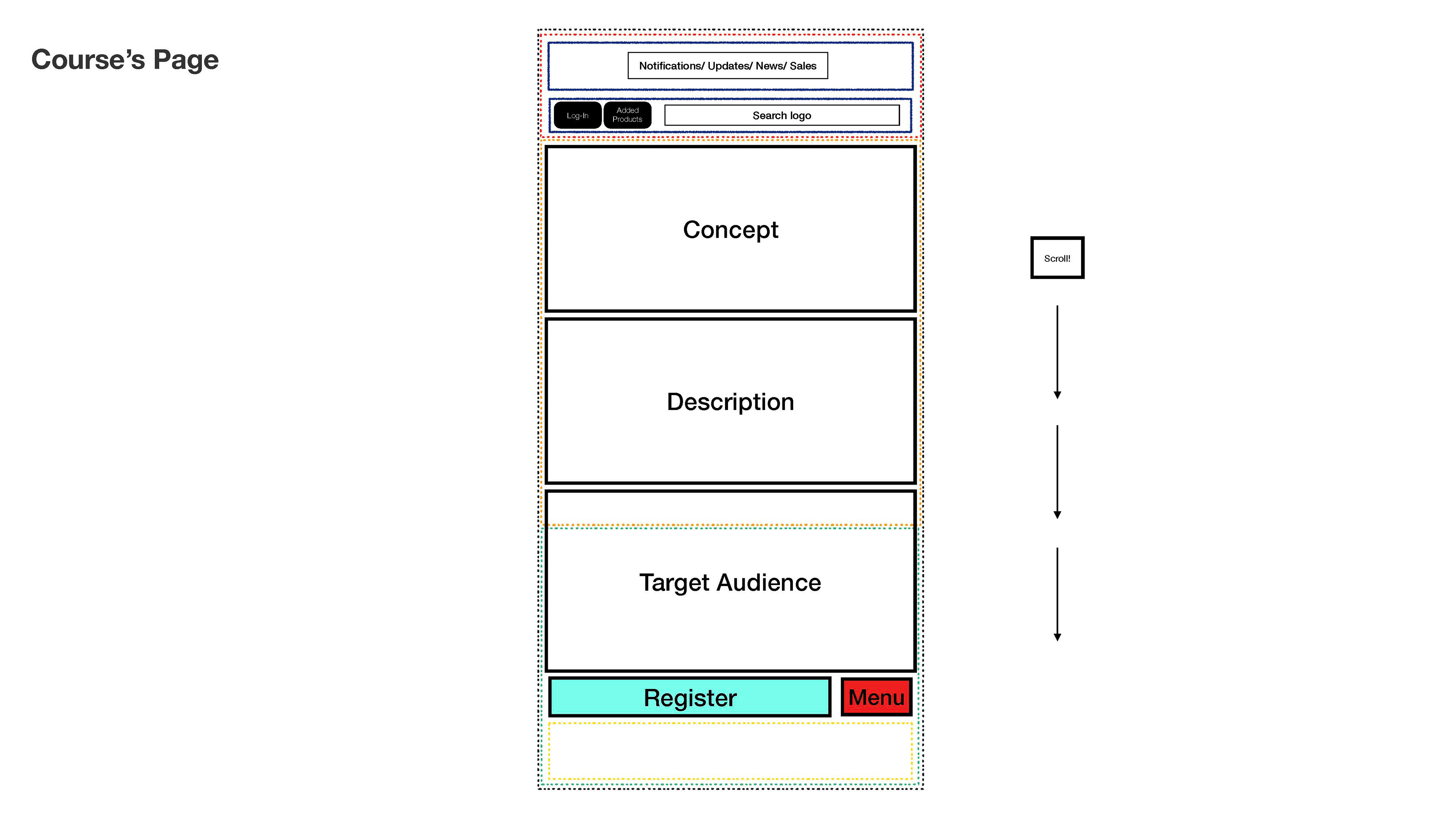
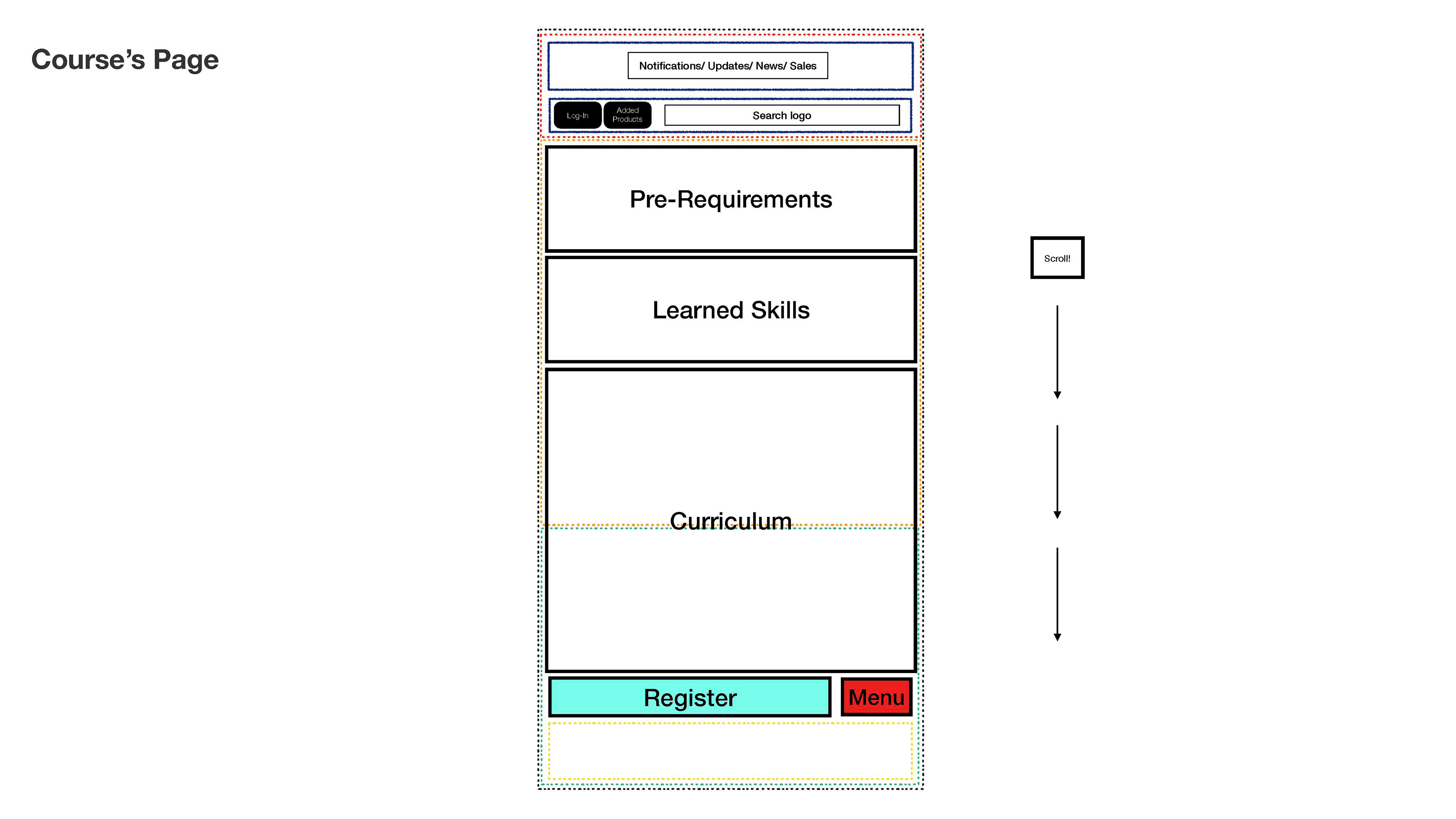

The final low-fidelity wireframes for the mobile-first redesign of the course pages. The primary goals of this new information architecture were to increase user engagement with course details and streamline the path to registration. The dotted lines represent ergonomic guidelines for the thumb zone, ensuring all primary buttons and menus are placed for comfortable, one-handed use.