Intro
CoreTech is a real-time web platform used by Hitachi to monitor transformer performance. It integrates sensor data, predictive algorithms, and visual dashboards to help operators detect risks early and extend equipment lifespan.

As the end-to-end UX Researcher and Designer for the CoreTech platform, my objective was to lead a full redesign initiative. This involved conducting in-depth user research to identify core usability failures and using those insights to produce a new high-fidelity prototype.

User Research Phase

The goal of this study was to understand why users found the existing Hitachi Energy monitoring software difficult to use. Early reports from field technicians suggested that the interface was complex, unintuitive, and hard to navigate.

Research Planning and Objectives

The research aimed to identify usability barriers, workflow inefficiencies, and information architecture of the software affecting day-to-day operations. The main objectives were:
- Diagnose causes of low task success and high error rates.
- Understand real user workflows and their mental models of how the software tasks are completed.
- Identify opportunities to simplify the system’s information architecture and task flow.

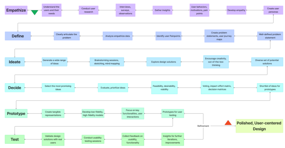
Research and Redesign Workflow. This diagram maps the project's journey from identifying the core problems that users found the existing interface complex, unintuitive, and hard to navigate, to the final deployment of a polished, user-centered design solution. This diagram was presented to the managers to explain the process and aim of my efforts.

Methods and Data Collection

A mixed-methods approach was applied, combining qualitative and quantitative techniques across three stages:
Contextual Interviews (3 participants): Early exploratory sessions to understand daily routines, pain points, and expectations of the system. For this aim, I observed and interviewed three engineers and field technicians performing different tasks in the software environment.
Usability Testing and Task Analysis (5 participants): Following the initial workflow analysis, I conducted a formal usability study focused on predefined tasks. During these sessions, I meticulously recorded and documented user interaction, noting hesitation, error types, and patterns, using detailed workflow diagrams and journey maps to pinpoint critical pain points..
Quantitative Survey (25 participants): The final stage involved validation and measurement of critical usability issues like error frequency, workload, and learnability. To validate prior findings and explore external factors influencing pain points, I devised a survey for engineers and field technicians. This survey included subjective ratings and questions about task failure, alongside questions capturing their estimated session duration and exploring patterns in their inability to achieve desired tasks with the software.​​​​​​​

Task Flow Analysis and Pain Point Mapping. A sample of the documented usability testing sessions. Each row represents a predefined task performed by a participant, captured using the Think-Aloud Protocol and direct observation to precisely map hesitation, error patterns, and critical pain points within the software workflow.

Key Findings

The mixed-methods study uncovered multiple structural and cognitive usability issues across three main categories:
 
Layout & Interaction Failures

Complex Learning Curve: The unnecessarily complex layout and lack of intuitive structure created a steep learning curve, requiring significant peer guidance and training time.
Accidental Input Changes: Features intended to help, such as scroll functionality and adjusting input numbers, actually harmed the workflow, leading to accidental, undocumented changes, especially when users needed to scroll quickly.
Poor Information Architecture: On data-heavy pages, the lack of settings grouping forced excessive scrolling and made locating related information difficult and time-consuming.
Hidden Help: The absence of contextual pop-up tips or tooltips for complex input fields required users to frequently ask peers what information was expected, slowing down the workflow.
Non-Responsive Layout: The desktop layout was compressed and distorted on the 7-inch transformer screen, making the software difficult to read and operate accurately.

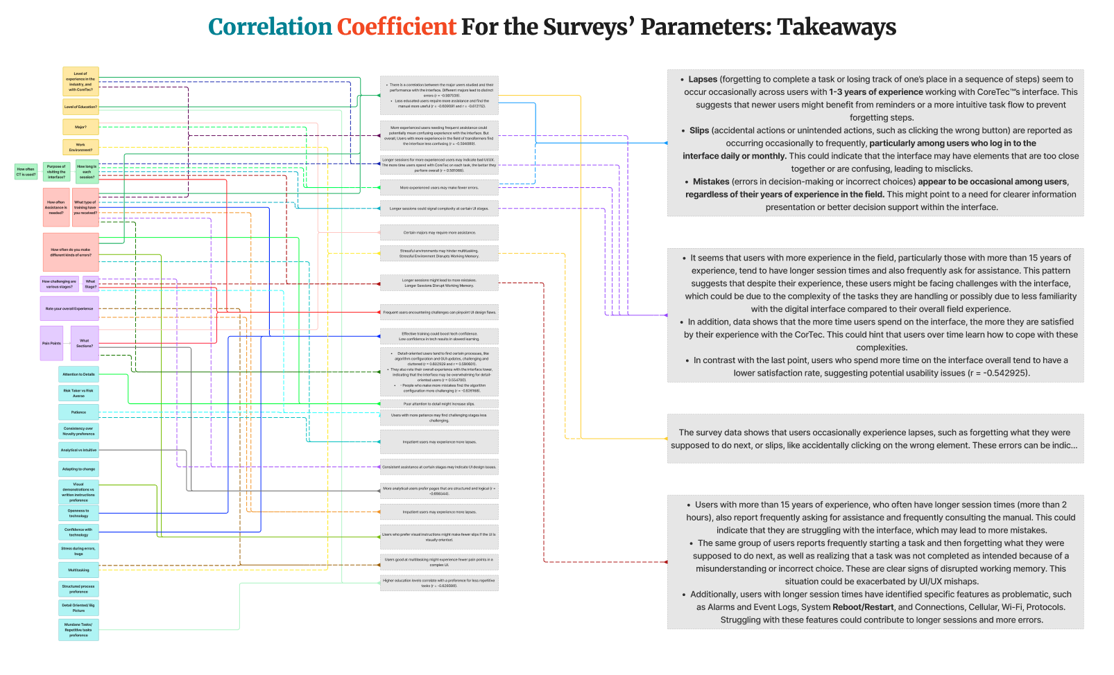
Synthesis of Survey Parameters and Usability Takeaways. This visualization maps the correlation coefficients between users' subjective ratings (e.g., pain points, perceived memory load) and objective data (e.g., years of experience, session time). The analysis directly links specific interface failures to distinct user behaviors and experience levels.

For instance, the analysis showed that users with 1-3 years of experience were more susceptible to lapses (forgetting steps) and slips (accidental clicks). This indicated that the interface required high memory load and lacked intuitive pathways, disproportionately impacting newer users who had not yet internalized the software's complex workflow.

Visual Design & Error Issues

Visual Complexity: Inconsistent iconography, spacing, and labeling made the interface visually overwhelming.
Target Size Errors: The survey revealed that the most common mistake was "clicking on an icon when you wanted to click on another icon near it." This demonstrated that interface icons were too small for efficient, fast operation.
Alarm Overload: Too many non-critical alarms led to alarm fatigue and the dismissal of important alerts.
Eye Strain: The absence of a dark mode created significant visual discomfort for technicians working in dim industrial environments.
Wasted Space: There were large areas of unutilized empty space not defined by design, which users felt could be organized and used more effectively.

Cognitive & System Mismatch

Navigation and Memory Load: Users repeatedly forgot menu paths, misclicked small elements, and required external guidance, indicating high cognitive load.
Terminology Mismatch: The system’s language reflected engineering jargon that was unfamiliar or confusing to field technicians.

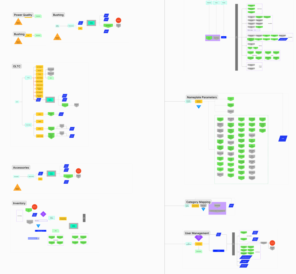
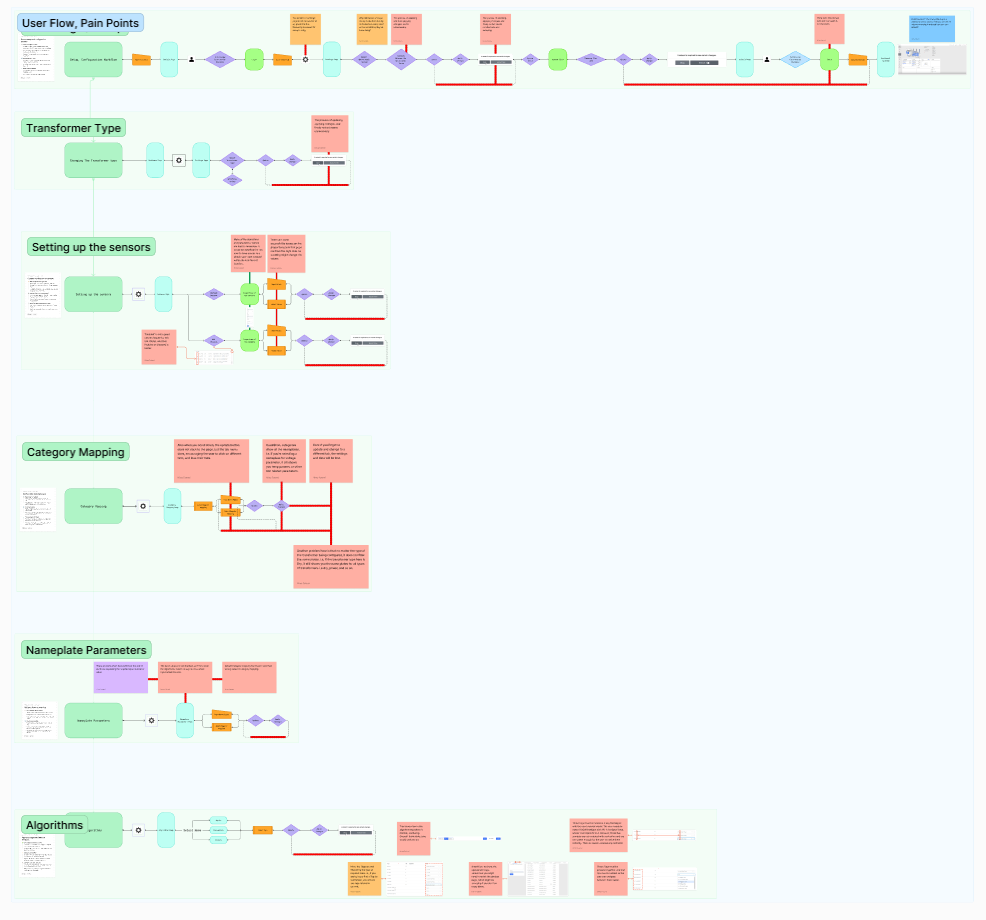
Task Analysis Mapping of Existing Workflows. This map visually dissects the workflows for key software functions (e.g., Power Quality, Accessories, Inventory). Each node represents a required click or step, clearly highlighting the excessive complexity and multiple decision points (pain points are flagged by color) that contribute to a high cognitive load and frequent errors.

Heuristic Evaluation

In addition to user testing, I conducted a formal heuristic analysis using Nielsen’s 10 Usability Heuristics, which is widely used for evaluating complex monitoring systems. At the end, I identified 86 violations.
Key heuristic violations identified included:
Visibility of System Status: The interface lacked clear feedback. Users could not always tell if a command (like updating a reading) had been successfully executed. In addition, the input fields lacked input sanitization. 
Match Between System and Real World: Terminology used engineering codes and abbreviations unfamiliar to technicians.
User Control and Freedom: Many actions had no clear “undo” or “cancel” function, creating fear of making mistakes.
Consistency and Standards: Icon functions varied between pages, and identical icons sometimes represented different features.
Error Prevention: Input fields changed values when users accidentally scrolled, causing data-entry errors.
Recognition Rather Than Recall: Important functions were buried in nested menus, forcing users to rely on memory.
Aesthetic and Minimalist Design: Excessive visual noise, alarms, and indicators reduced information clarity.
Help and Documentation: No quick access or contextual help existed for troubleshooting.
This evaluation confirmed that the usability challenges were not isolated to user skill level, but deeply embedded in the information architecture and interaction design of the system.

Heuristic Evaluation: Identifying Systemic Flaws. A visualization of the diagnostic process used to pinpoint severe usability flaws. This sample highlights key violations like a lack of clear feedback and a Match Between the System and real-world issues.

Analytical Insights

By combining the heuristic findings with usability data and survey responses, two major themes emerged:
Structural complexity: The system’s task and information architecture lacked logical sequencing.
Cognitive overload: The interface presented too much data without a visual hierarchy or relevance filtering.
Survey responses on learnability and task confusion validated that users lacked a clear mental model of how the software operated. Many usability errors were design-induced rather than user-driven.
Synthesis and Communication

The findings were consolidated into user personas, journey maps, and an error taxonomy that described real-world challenges from the technician’s perspective.
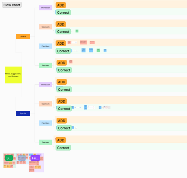
Over 13 hours of stakeholder discussions were held with developers and R&D managers to align findings with system constraints and prioritize feasible changes.
This research phase provided the foundation for the Low- and High-Fidelity Design Phases, where information architecture, dashboard design, and visual hierarchy were redesigned and validated through iterative prototyping.

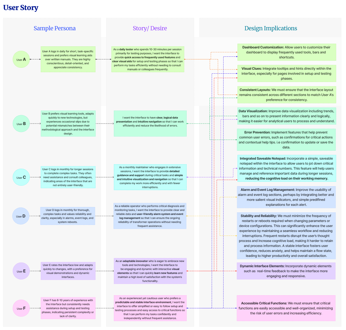
Analytical Insights and Design Strategy Foundation. The final analysis confirmed that usability errors were design-induced rather than skill-based. The findings were consolidated into narrative tools like user personas, providing a clear, validated foundation for the subsequent iterative redesign phases.

Back to Top